What is Adobe Color & How Can It Help You as a Photographer?
Adobe Color is a web app and creative community where you can create and share color themes and inspiration. It's a useful tool for photographers - here's why.
By Ana Mireles
Adobe Color is a web app and creative community where you can create and share color themes and inspiration.
Formerly known as Adobe Kuler, it was renamed in 2014 to better align the tool with the rest of the Creative Cloud family.
It’s 100% free to use at color.adobe.com – you can start experimenting with various tools for creating your own color palettes and color themes.
As a photographer, you can use Adobe Color to help plan your photoshoots to include complementary, analogous, triadic, and various other Color harmony rules.
Whether you’re familiar with color theory or not, Adobe Color is a fun and easy way to learn more about which colors and shades work well together to create a more powerful image.
Let’s take a closer look at how you can use it.
How to Use Adobe Color to Create Color Themes
Many people think only graphic designers need to use a color palette for their projects, but photographers also work with color combinations – and establishing color schemes is essential.
Up until July 2020, there was an Adobe color themes panel inside of Adobe Photoshop, and it coexisted with the Adobe Color app on the browser – now, you can only find it online. Fortunately, it still works in combination with Adobe products, thanks to the Creative Cloud.
It’s also possible to use the Adobe Color App without an Adobe Creative Cloud account – but the workflow is not that smooth.
Either way, using color schemes will help you to plan photoshoots, color grade your images and generally improve your photography.
You can take a closer look at Adobe Color here.
Color Wheel
This is the most versatile tool of Adobe Color CC. It’s a super quick way to create a color palette – in the app is referred to as a color theme.
You can establish a base color and create multiple themes by changing the harmony rules available on the left. You can also change the Color Mode using the drop-down menu. By default is in RGB, but you can choose CMYK, HSB or LAB.
You can use the color wheel to modify any color scheme created with the Extract Theme tool or the ones found in Explore and Trends.
You can save the Color palettes on your Library and access them on any of the Adobe apps, or you can download them to your computer if you don’t have a Creative Cloud account.
Extract Theme

Image: Pavel Danilyuk
This tool allows you to upload an image and extract its color palette. If you have an Adobe subscription, you can save it on the Library and access it later in Photoshop, Illustrator or any of the Adobe apps – otherwise, you can download it as a JPEG.
Then, you can create swatches to have the color scheme available with any image.
Extract Gradient

Image: Pavel Danilyuk
Like the previous tool, you can upload a photo of your choice. Adobe Color extracts the color scheme and creates a gradient with it. This too can be saved in your Library or your desktop and used later in Photoshop for creating gradient maps.
This is a great way to color grade your images and create a consistent look with your color photography.
Accessibility Tools

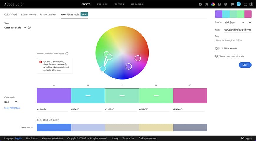
This section includes the new features of Adobe Color CC – the Contrast Checker and the Color Blind Safe tool.
The contrast checker analyzes the contrast ratio between two colors. This is mainly used by graphic designers to determine whether the color of the text and graphic elements is readable against the background colour.
It’s also useful for photographers if you need to choose a backdrop color where you know the client’s logo should be.
The Color Blind Safe tool analyses the color theme and tells you if there’s a potential conflict between swatches for people with color blindness.
How to Choose The Color Harmony Rules
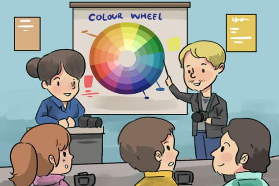
You’ve probably heard about primary colors, complementary colors, triadic colors and other related terms. They’re part of a broad subject called color theory – this is what Adobe Color uses to help you create a color theme.
Let’s see the different tools Adobe Color gives you to make color choices.
Create

In the previous section, you saw the different ways you can create color themes – but to use the harmony rules, you have to be in the color wheel.
According to the Adobe Color’s description, “color rules ensure a harmonic balance of color based on the color you have set as Base Color”.
So, the first thing you need is to choose one color to be the base of the color theme. You’ll find the base color in the center of the color scheme – it’s marked with a small white arrow. To change it, you can input the HEX code or click and drag the base color selector on the color wheel – this one also has the small white arrow.
Now that you have the base color, you can create different color palettes around it using the different harmony rules on the left.
The last choice you’ll find is named Custom. You can use that one to create your own color palettes freely – without following any color rule.
Explore

When you put color theory together with the psychology of color, you’ll have a powerful combination. Each color scheme communicates a different mood or concept. This is what the Explore tab of Adobe Color is all about.
Using the search bar on the top, you can browse color palettes based on moods, keywords, colors, etc. Simply input the word, and Adobe Color will show you what other artists do with that concept.
Let’s say your client wants the images to have a ‘summer feel’. You can come to the Explore tab and search color themes with the words summer, ocean, sunny or vacation, and use these colors to plan the photo shoot.
You can save the color palette on your computer or the Cloud Library and use it as it is. However, the most interesting part is that you can use it as a starting point in the color wheel and modify it using the harmony rules.
Trends

While color theory is universal, color psychology is cultural. So, a successful color palette in one sector might not work in another. It’s also time-sensitive because color trends are in continuous change.
The Trends tab of Adobe Color allows you to see what is trending in different communities on Behance and Adobe Stock. For example, fashion, travel, landscape, architecture, graphic design, etc.
This tool is extremely useful when creating images for stock photography websites because trendy ones will attract more clients. It’s also helpful to create an eye-catching Instagram feed and can get you a lot of followers and likes.
You can save any of these color palettes or use them to create a theme in the color wheel.
Final Words
I hope this article gave you a good introduction to using Adobe Color’s features for inspiration and simplifying your workflow.
If you have any questions or suggestions, let us know in the comments.


Check out these 8 essential tools to help you succeed as a professional photographer.
Includes limited-time discounts.


